Featured Projects


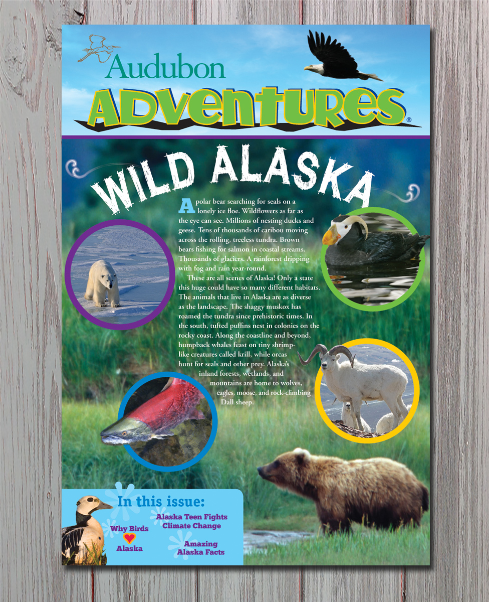
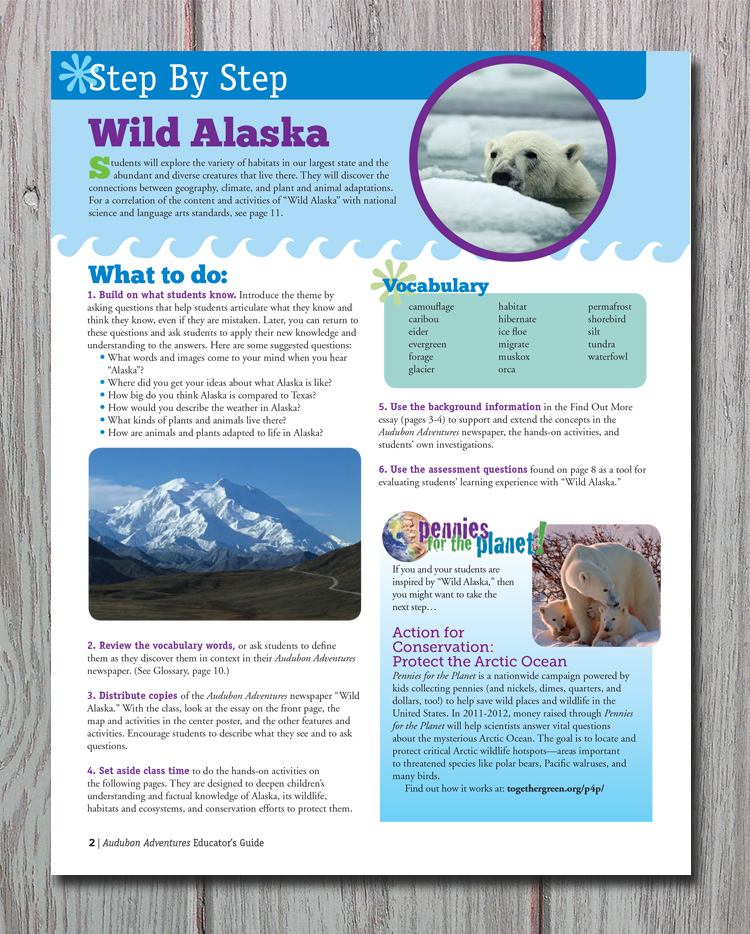
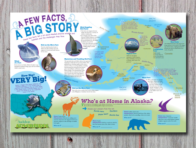
Audubon Adventures
Magazine, teacher's guide, poster
challenges
Redesign a magazine for kids in a fun, yet organized style
goal reached
By adding a bright color palette, new fonts and a clean layout style, I was able to update the look of the magazine and poster. The teacher's guide was organized into easy to understand sections with the same fonts and color scheme.